Skip Navigation
How do you begin combining data from cloud applications with your internal databases to gain insight into your business? Maybe your organization is already using Google Data Studio as your analytics tool, but you're still learning about using it with multiple data sources.
To analyze data from diverse sources, you should maintain a data warehouse that consolidates all of your data in a single location. Most businesses take advantage of cloud data warehouses such as Amazon Redshift, Google BigQuery, and Snowflake.
You can extract the data you have in SaaS applications and databases and load it into your data warehouse using an ETL (extract, transform, load) tool. Once the data is available, your analysts can use it to create reports.
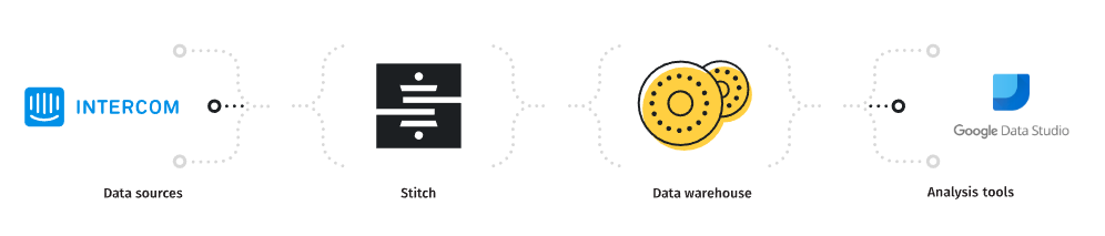
Three tiers of the data analytics architecture
Most data analytics stacks comprise three tiers: ETL software, a data warehouse, and business intelligence (BI) software.
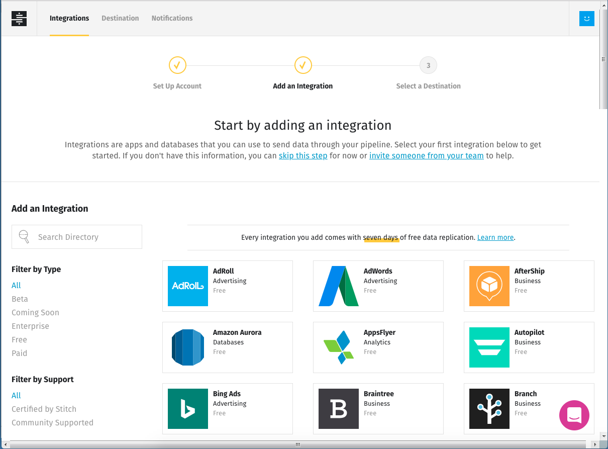
Stitch provides a simple, powerful ETL service for businesses of all sizes, up to and including the enterprise. Sign up and you can be moving data to a data warehouse in five minutes. Choose at least one of Stitch's integrations as a data source. Most businesses get more value out of their data as they integrate more data sources; for our example, we'll look at data from two separate SaaS applications.
If you don't already have a data warehouse, consider Google BigQuery, for which Data Studio has a native connector. BigQuery is free for 10GB of storage and one terabyte of queries per month.
Google Data Studio serves as the third layer of our data analytics stack. Data Studio is a free web-based tool that provides about a dozen different kinds of visualizations, including bar, pie, and scatter charts. Available connectors include common data warehouse platforms such as Google BigQuery and PostgreSQL.
Data Studio is currently in beta, and it's a little rough around the edges. While creating my visualizations I found the user interface got in my way as I worked. For instance, adding multiple dimensions or metrics pushes the data filtering controls below the bottom of the screen, and there's no scroll bar to bring them back. Also, controls for customizing the look and feel of visualizations are minimal.
Setting up a data warehouse
I used some of Stitch's real data to build a data visualization for this post. Specifically, I used billing data stored in Salesforce, and joined it with support conversation data from Intercom to create a visualization of support conversations.
To run analyses with data from different sources, you should load the data into a data warehouse. Since Data Studio has native support for the BigQuery data warehouse, I set up a BigQuery account. Following our documentation, I added permissions to my BigQuery user that Stitch would need in order to load data.
Using Stitch makes extracting data from a source and loading it into a data warehouse easy. I logged in to Stitch and added new integrations for Salesforce and Intercom, following the instructions in our documentation. From Salesforce I selected the Account table to replicate. Stitch's Intercom integration automatically extracts data from all available tables. From both, I chose to replicate data going back to the beginning of the year.
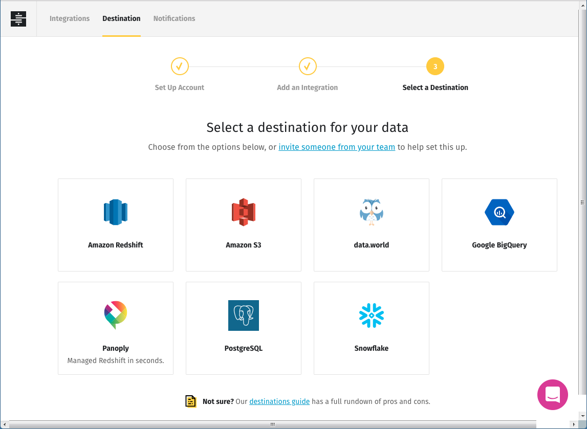
Once I'd set up my integrations I added BigQuery as my destination and specified a BigQuery project name. Within a few minutes, Stitch extracted the data I specified and loaded it into BigQuery.
Setting up data sources in Data Studio
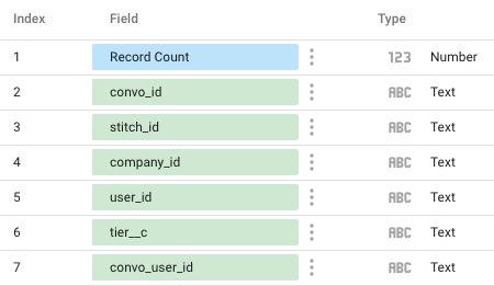
Now I had data from two sources in BigQuery. To make it available in Data Studio, I signed in, then clicked on Data Sources, then the new (+) button, and followed Google's documentation for creating data sources. I selected my project, dataset, and table, then clicked Connect. The next screen lets you make changes to the fields in your table, including removing any you don't care about from your data source. When you're ready, click on Create Report or Explore, and your data source is created. After I did that, I went back to the Data Sources home page and renamed my data sources to something more memorable than the default.
I created a couple of preliminary reports to check the content and format of the fields in my tables. I clicked on Reports, then the new (+) button create a new report based on the data in a single table. I clicked on the table tool at the top of the window, then clicked and dragged out a rectangular area in the workspace. Data Studio created a table with a default metric and dimension that it chose seemingly at random from the available fields. I had to replace those values with the metrics I cared about. I ran through the process for my Salesforce Account and Intercom Users and Conversations tables, and the reports showed me that I had the data I needed.
A table like this, or a visualization based on one table's data, may be all you need for simple reporting. But I wanted to answer a more complex question.
Data source based on a custom query
Google says, "By default, charts in Data Studio get their information from a single data source." A data source may be anything for which Data Studio has a connector. When the data source is a data warehouse, the data source may be a table in a dataset you create, one people share with you, public datasets, and datasets based on custom queries.
Data Studio can join data from two sources in a single report using what it calls "data blending." The report I wanted would require joins from multiple tables, so data blending was not an option. Instead, I built a data source based on a custom SQL query.
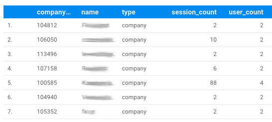
I took an incremental approach to building my query in the BigQuery console. A look at the Intercom schema showed me that to associate the number of conversations with the Stitch customer ID, I'd need to join the Intercom Users and Conversations tables. The Users table contains a field called companies that contains information about the companies a given user is associated with. That field is a list that could contain multiple values – a nested data structure, in other words. Many data warehouses don't support nested data structures, but BigQuery does. It stores each list in an array.
Retrieving data from a nested data structure is tricky if you're used to working with fully normalized data. I fumbled and stumbled until my colleague Erin, Stitch's senior technical documentation manager, set me on the right path with this query:
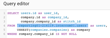
The SQL UNNEST operator takes an array and returns a table, with one row for each element in the array.
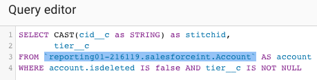
To get the plan tier information from our Salesforce Account table, I created another query:
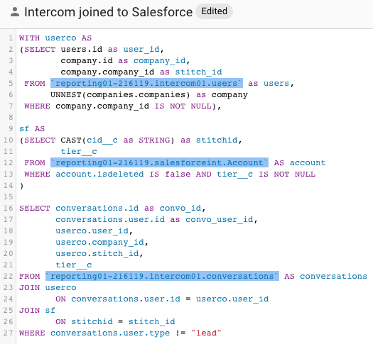
I used those those queries, along with data from Intercom's Conversations table, to retrieve the data I wanted, joining Intercom and Salesforce data:
Running this query in the BigData console gave me the data I wanted. The next step was to use it to create a new data source in Data Studio.
Earlier I had specified My Projects as the data source for my table reports. This time I specified Custom Query, chose the billing project under which my tables lived, and pasted in the query above. I unticked the Use Legacy SQL box so I could use standard SQL. By default Data Studio gives a new data source the name "Untitled Data Source" – I renamed mine to something meaningful. Finally I clicked Connect, and Data Studio created my data source:
Creating the report
To use the new data source, I clicked Create Report, and Data Studio created an untitled report, which again I renamed to something meaningful.
I clicked on the bar chart tool at the top of the workspace, then dragged out a box to create my visualization. As it did with the smaller tables earlier, Data Studio chose some random fields as dimension and metric. I replaced them with the tier__c field as the dimension and a count distinct of conversation IDs as the metric:
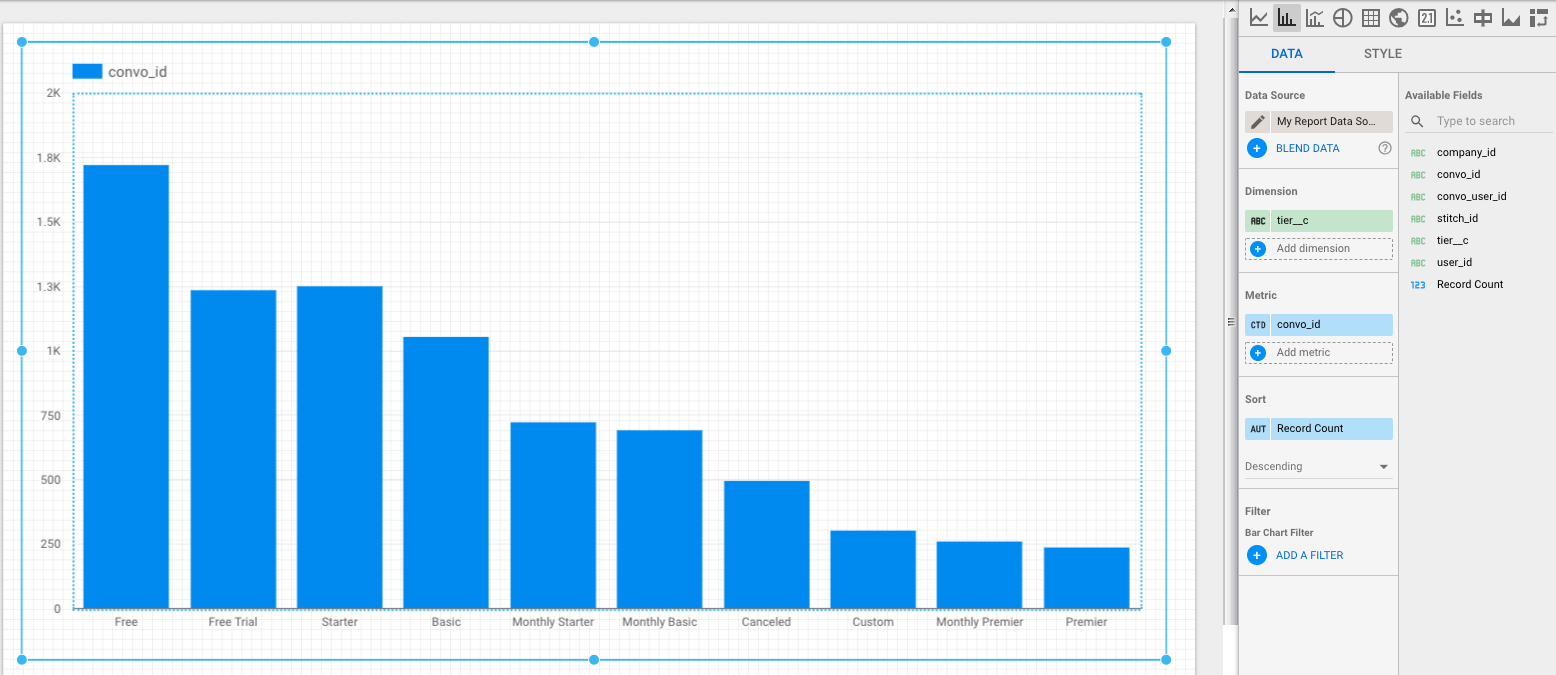
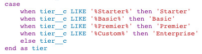
This was almost the visualization I wanted, but I didn't care about billing cycles – I wanted a single bar for the data in, for instance, Basic and Monthly Basic. I changed the custom query in my data source to replace the tier__c field with a case statement:
Here's my final visualization:
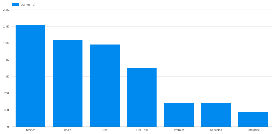
It took a bit of doing, but in the end I got the visualization I wanted.
That's how you use an ETL tool like Stitch to move data from multiple sources into a data warehouse, then report on it using Data Studio. Sign up for a free trial of Stitch and start creating your own.
Give Stitch a try, on us
Stitch streams all of your data directly to your analytics warehouse.
Set up in minutesUnlimited data volume during trial